Building a Scalable Design System for SaaS Platform
Client: SaaS for wealth management professionals
Industry:
Fintech
Duration:
Feb 2024 - Sep 2024
Role:
Lead Product Designer
Overview
At SaaS Platform, I rebuilt the design system from the ground up — starting with foundations (colors, typography, icons, grids, spacing, tokens) and extending into atoms and molecules. The goal was to establish consistency, scalability, and efficiency across teams, while aligning design with business and development needs.
“The deeper the foundations, the stronger the system.”
Context & Challenge
The platform had grown rapidly, but the design system hadn’t
kept pace. This led to:
- Fragmentation: Inconsistent colors, typography, and icons across features.
- Inefficiency: Designers and developers spent extra time correcting inconsistencies.
- Scaling challenges: Every new feature introduced new styles, slowing product development and creating UX inconsistencies.
Without a unified system, each release multiplied small inconsistencies, negatively impacting user experience, brand identity, and team productivity.
Benchmarking & Research
Before defining a new system, I researched industry-leading design systems, including Atlassian, Material Design, Apple HIG, and Shopify
Polaris. This research helped inform:
- Best practices for scalable foundations
- Tokenization strategies for colors, typography, and spacing
- Component structure and reusable patterns
“A system is only future-proof when it learns from the best.”
My Approach: Foundations First
I started the redesign with deep work on Foundations, because a strong
base ensures consistency, scalability, and efficiency across the
platform. This stage covered:
Colors
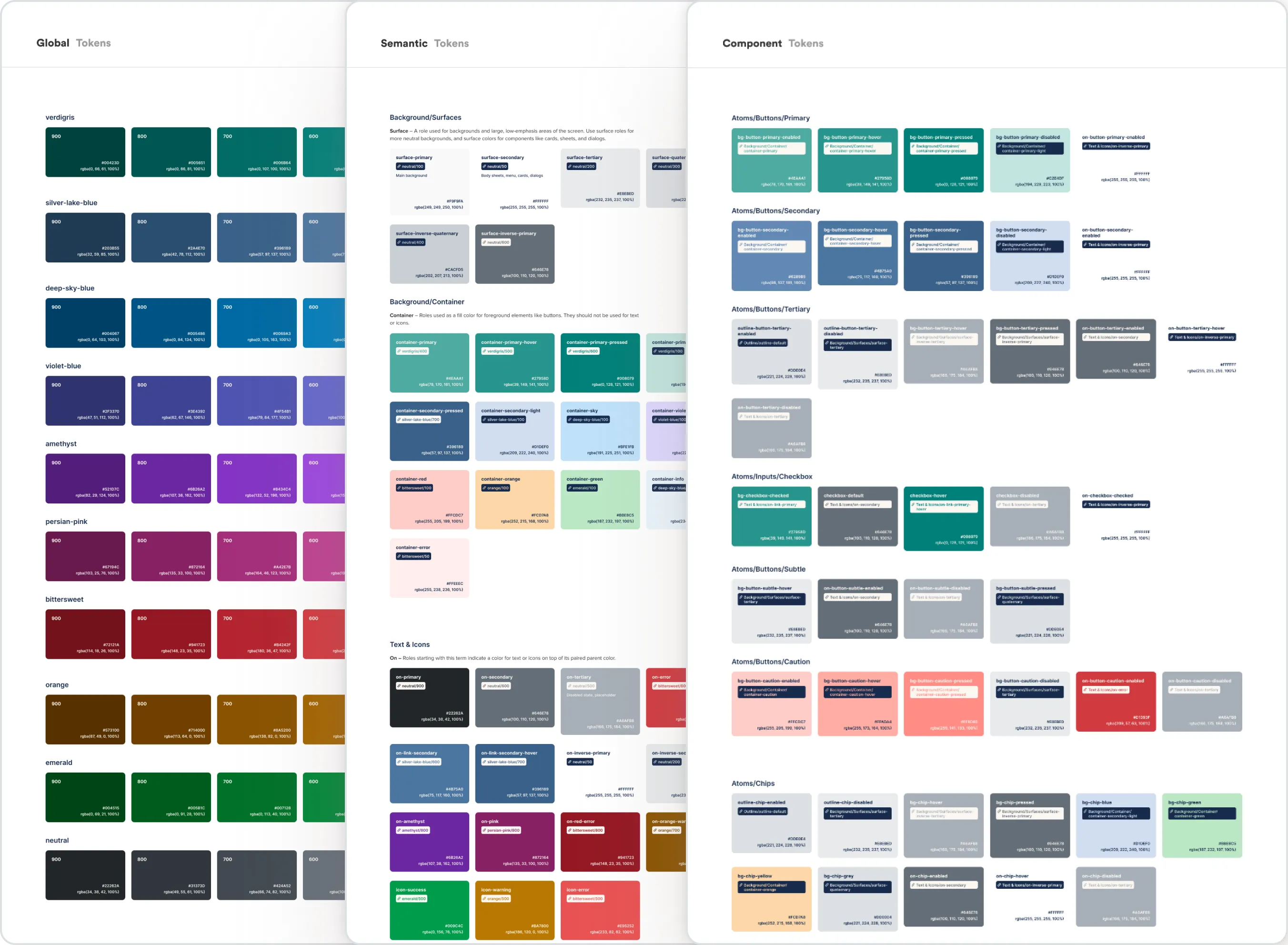
We implemented a tokenized color system with three levels:
- Global Tokens: Complete color spectrum, defined by base hex codes.
- Semantic Tokens: Map colors to functional roles (backgrounds, surfaces, text)
- Component Tokens: Apply semantic tokens to specific UI components.
Why it mattered:
- Ensured visual consistency across components.
- Made the system scalable for future features.
- Improved accessibility, usability, and maintainability.
Typography
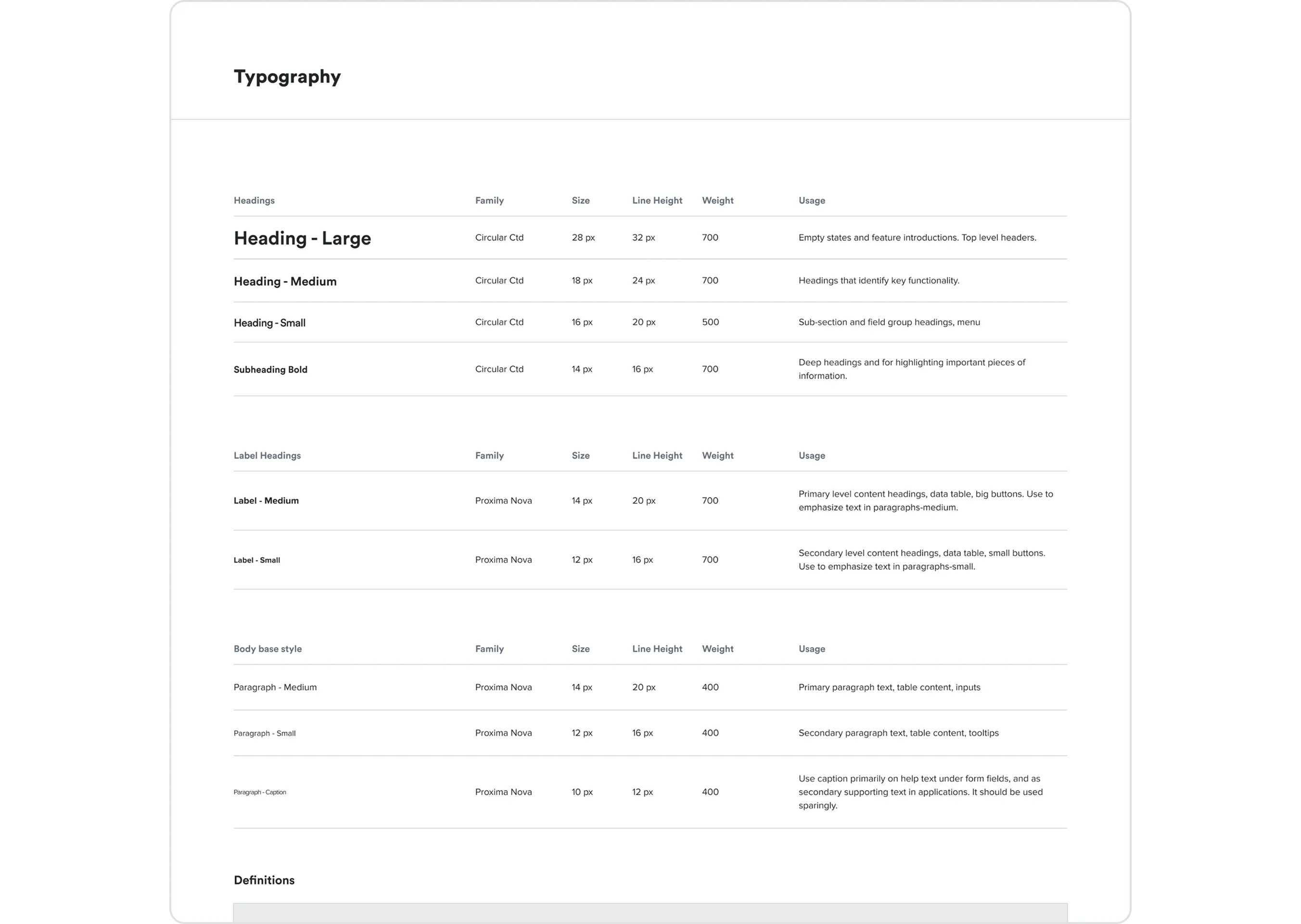
We standardized all text into Headings, Labels, and Body styles:
- Headings: Used for headlines, navigation, and section titles.
- Labels: Short contextual text for UI elements.
- Body: Longer form content for reading.
Integration steps: Audit → Map
old to new → Update Figma library → Update components → Developer
handoff → QA & testing.
Business value:
- Improved readability and UX.
- Cohesive look reinforcing brand identity.
- Streamlined design and development workflows.
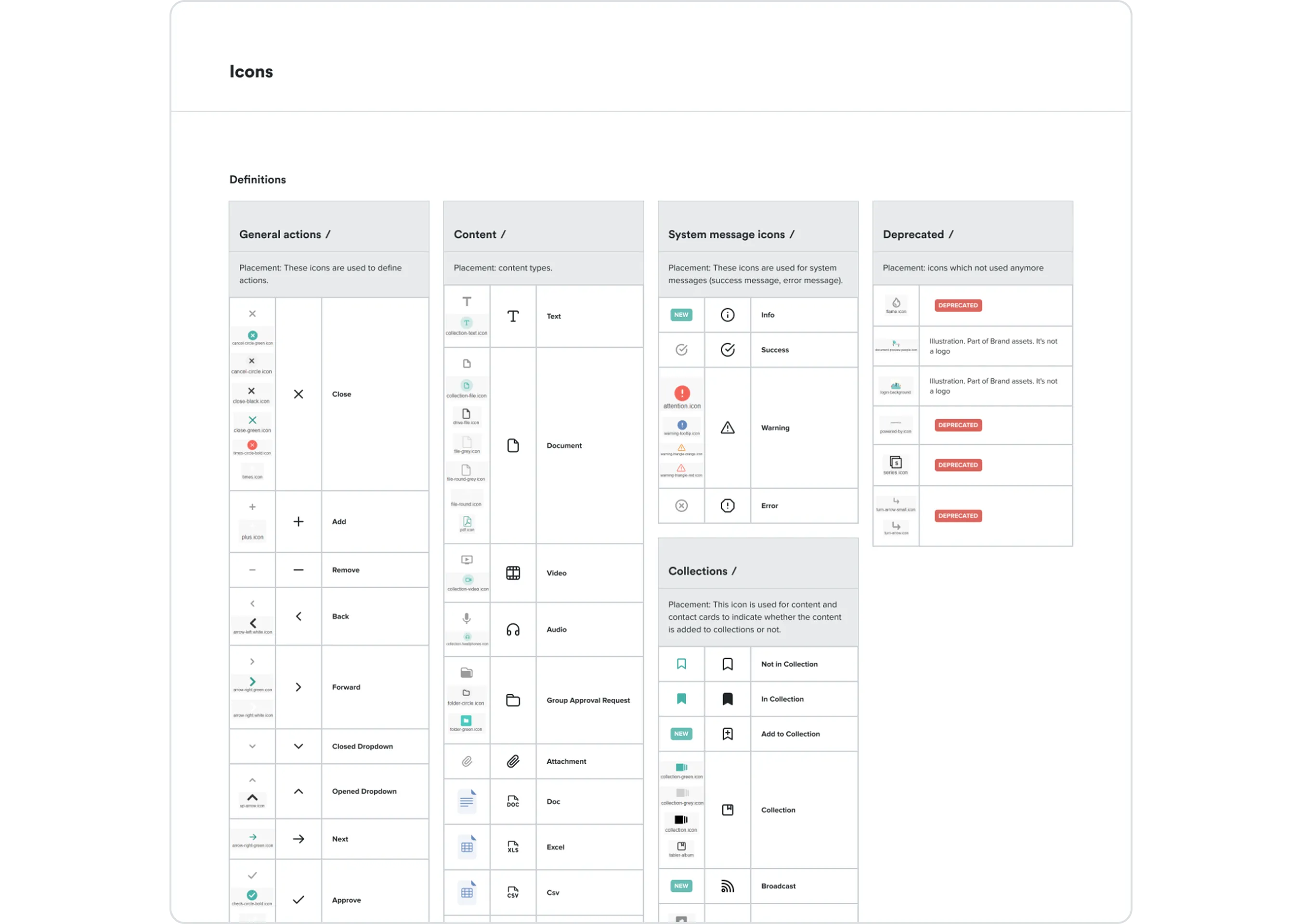
Icons
- Conducted an inventory of existing icons, identified inconsistencies, and replaced them with a modern, unified set.
- Icons were grouped by category, documented, and added to the design system library.
Impact:
- Enhanced clarity and usability.
- Modernized the platform’s visual language.
- Improved designer-developer alignment.
Layouts, Spacing & Radius
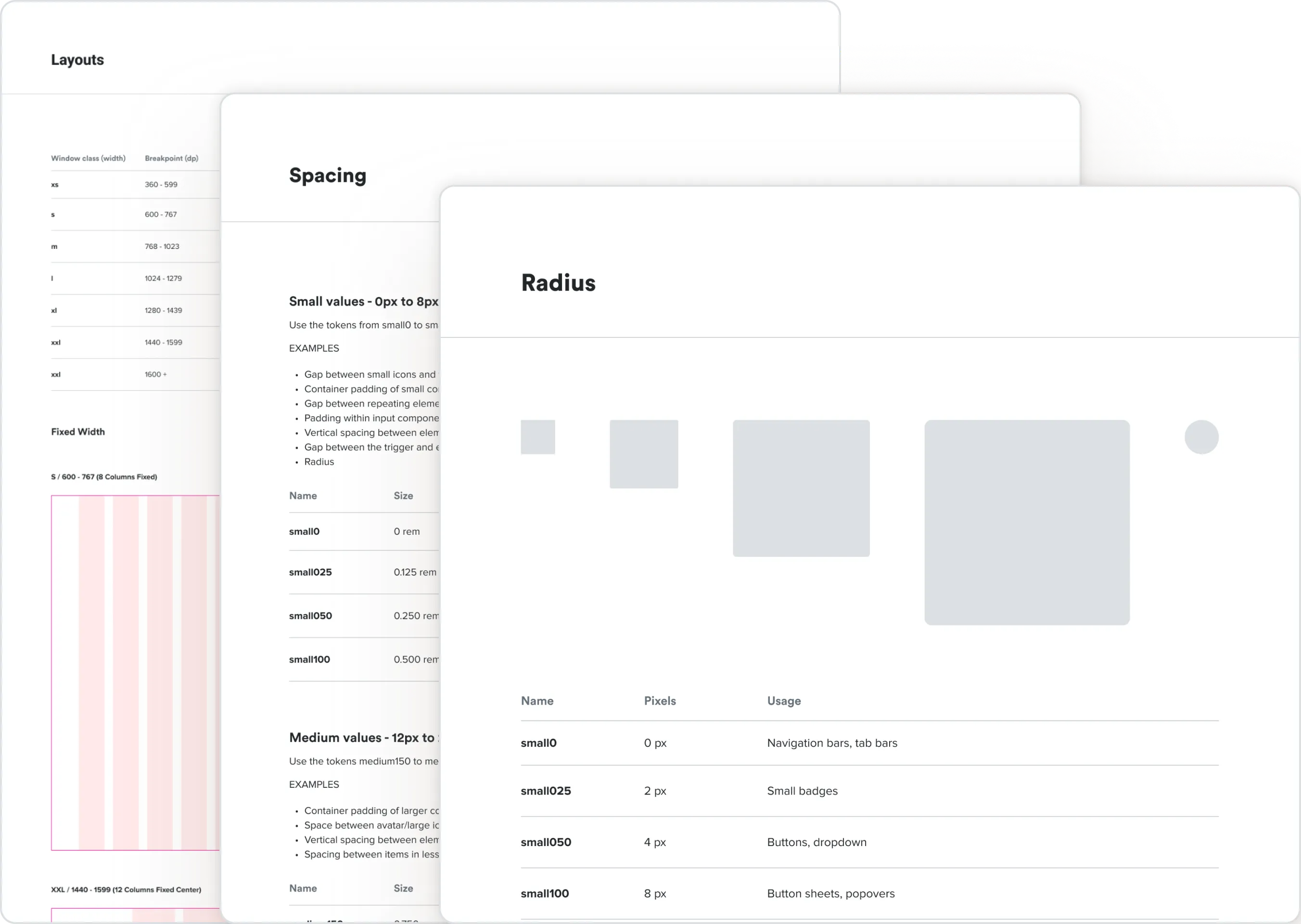
- Defined fixed and fluid grids for responsiveness.
- Spacing values categorized into Small (0–8px), Medium (12–24px), Large (32–80px).
- Radius and padding standardized for components of all sizes.
Building Blocks (Atoms & Molecules)
Once the foundations and tokens were in place, I focused on designing
the reusable building blocks that would
power the SaaS Platform. These blocks serve as the core components for
every screen and interaction, ensuring scalability, consistency, and efficiency.
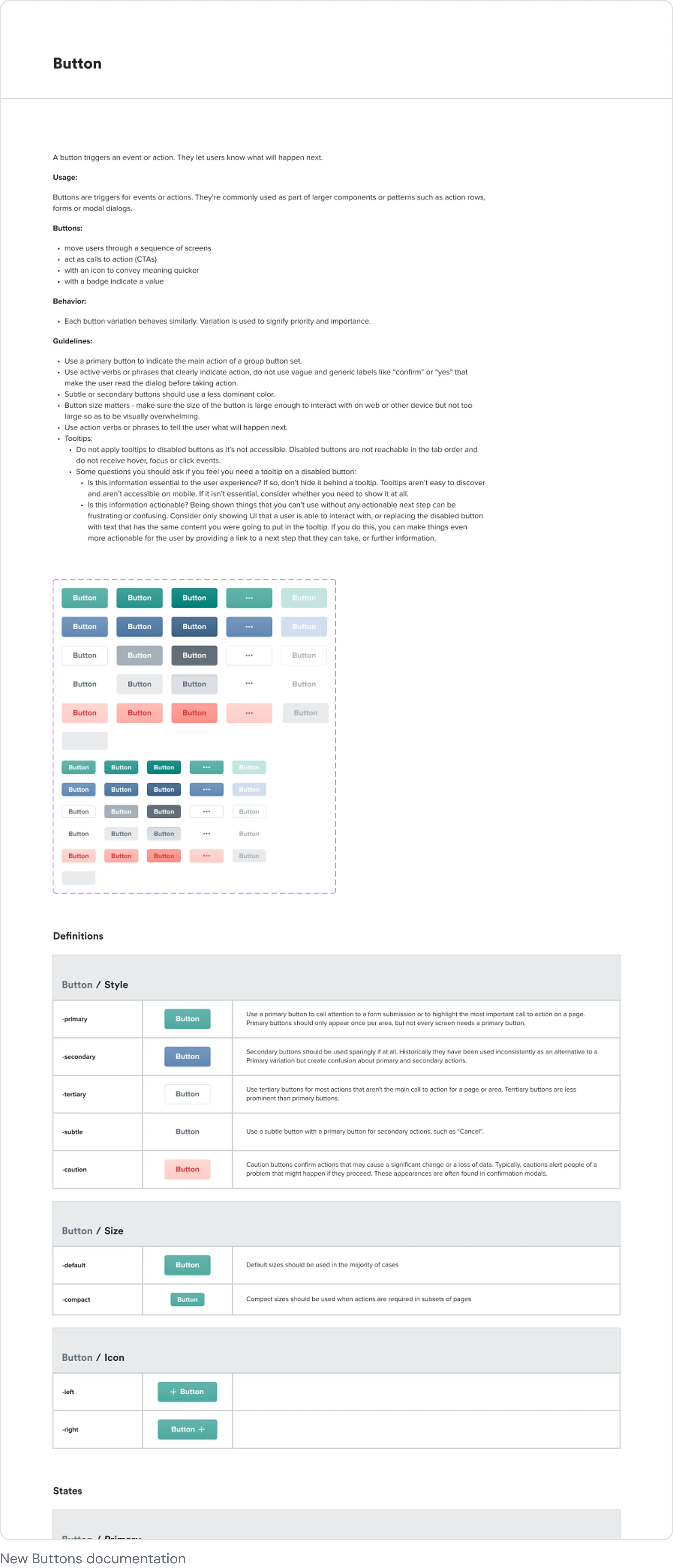
Atoms
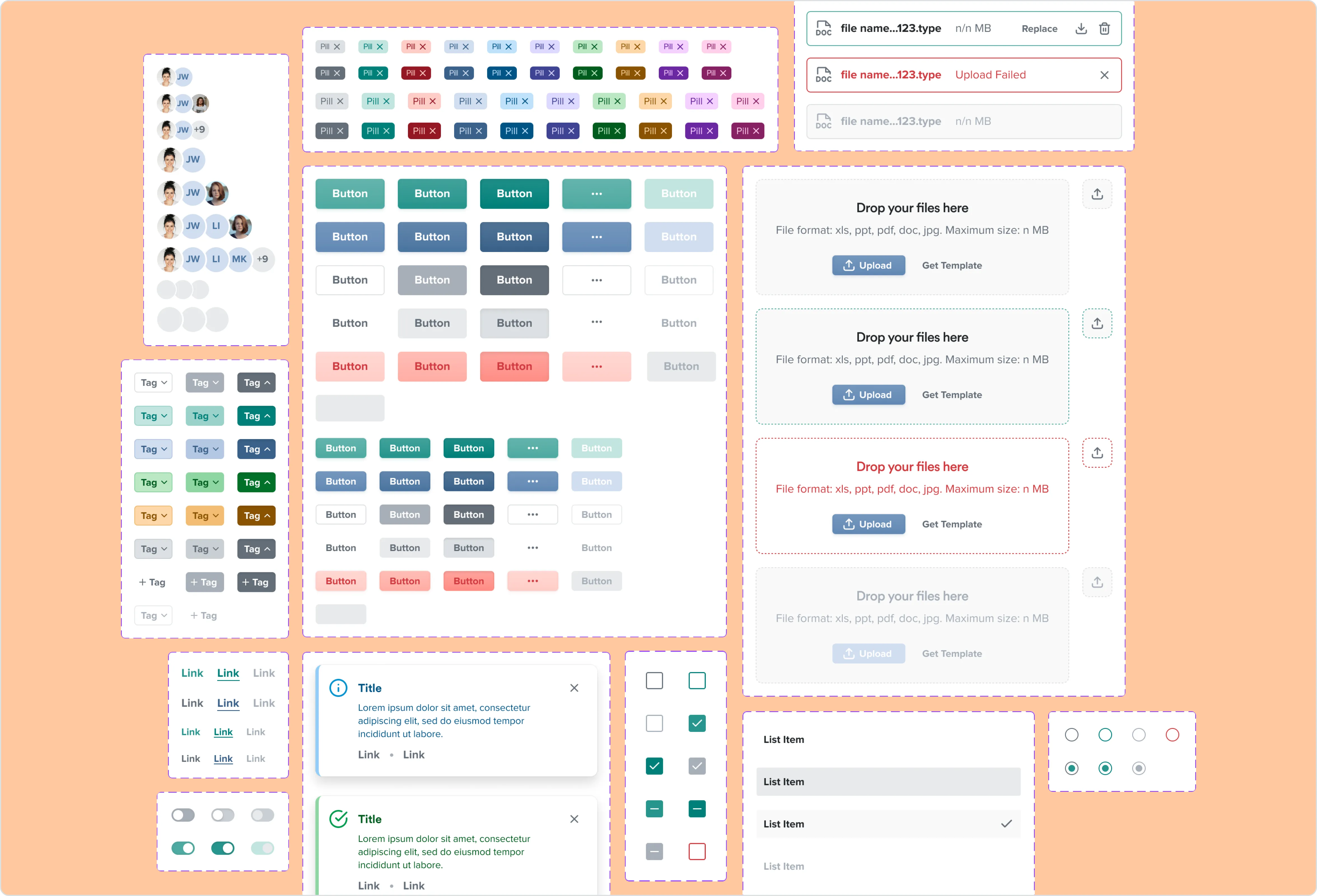
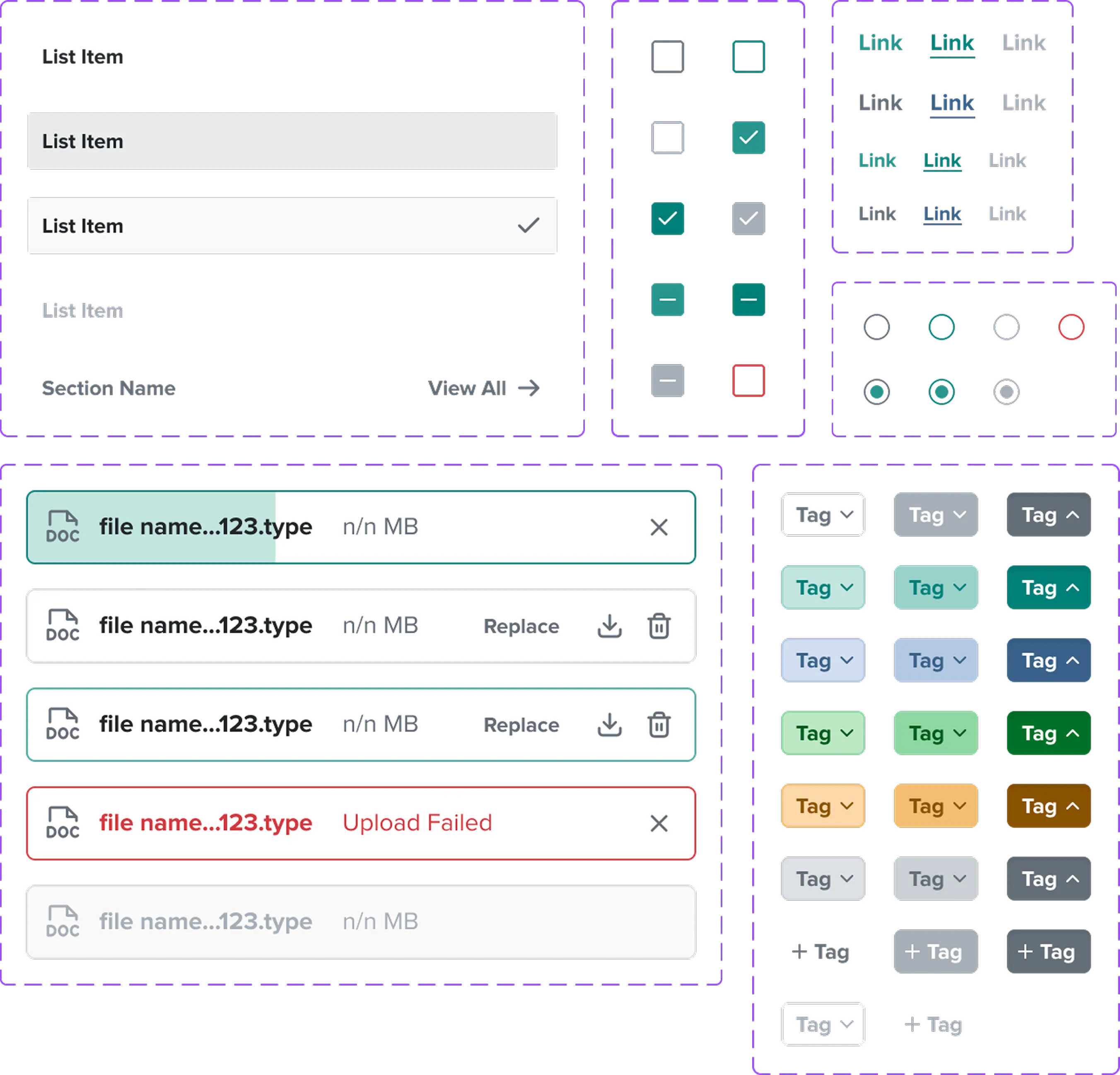
The smallest UI elements include:
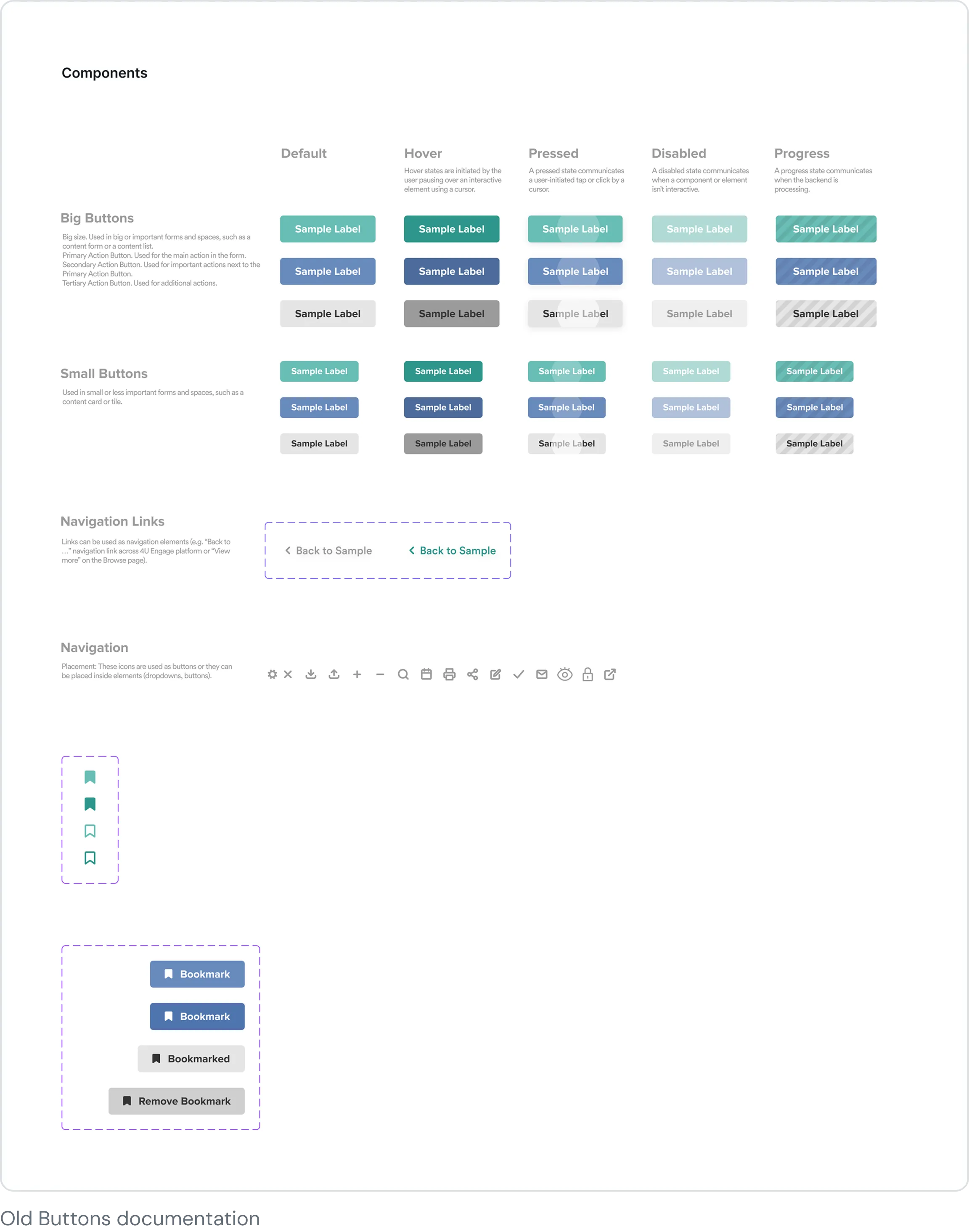
- Buttons (primary, secondary, text, icon-only)
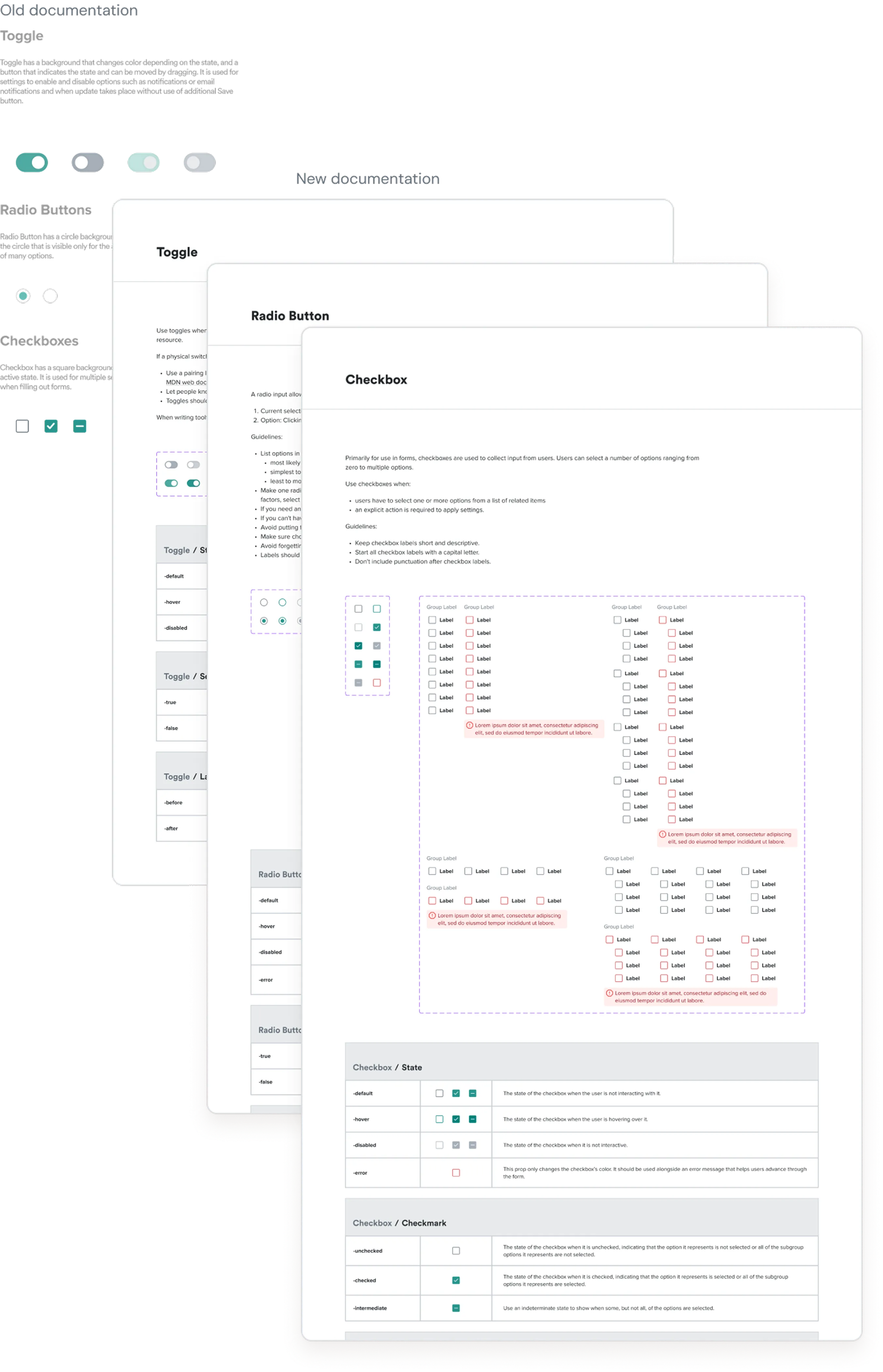
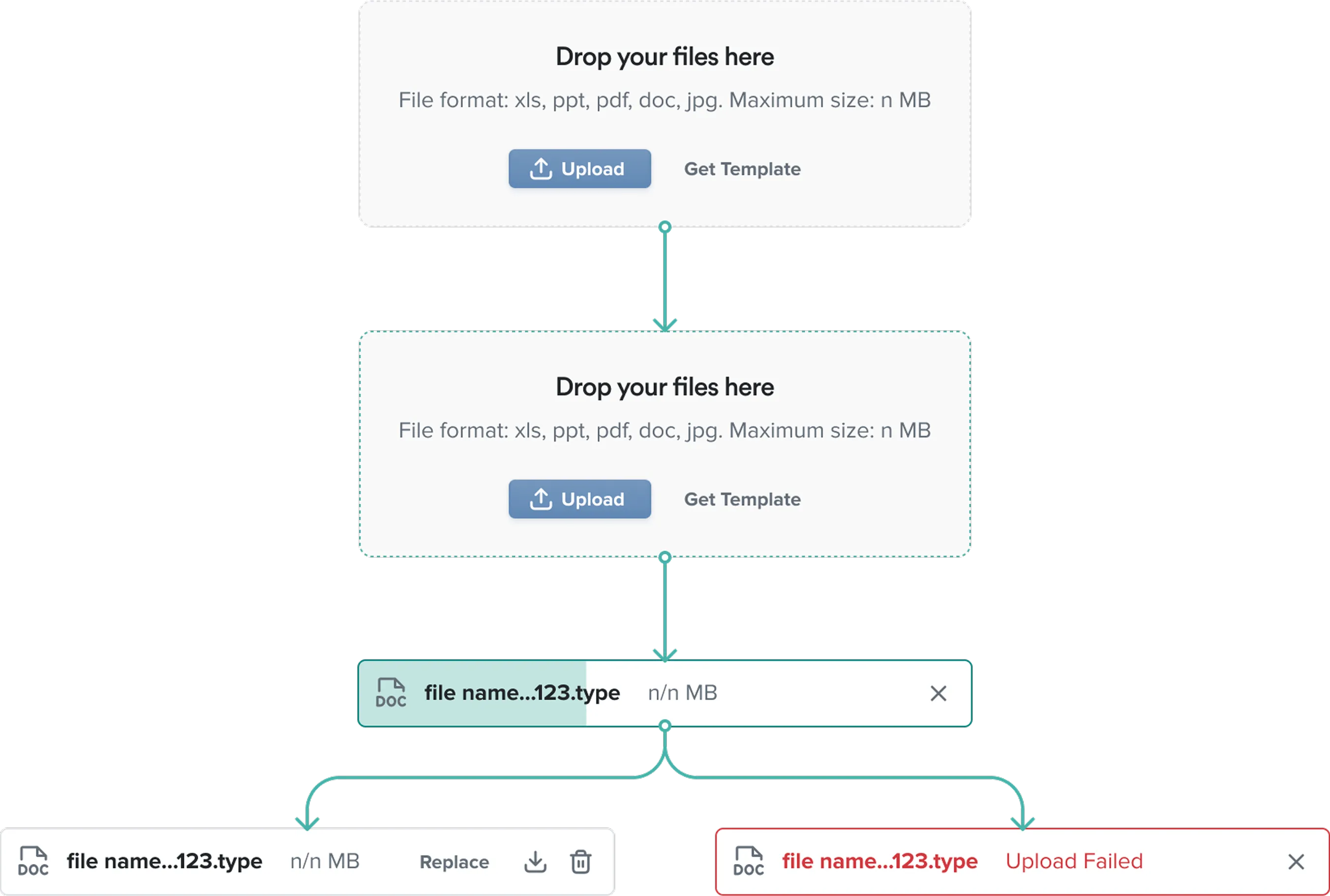
- Inputs & Selectors (Textfields, Textareas, Checkboxes, Radio Buttons, Toggle, File Upload)
- Avatars (standardized, scalable, and tokenized)
- Breadcrumbs, Chips, Links, Pill Tags, Tooltips
These elements were fully tokenized for color, typography, spacing, and elevation, allowing instant updates
across all screens.
Molecules
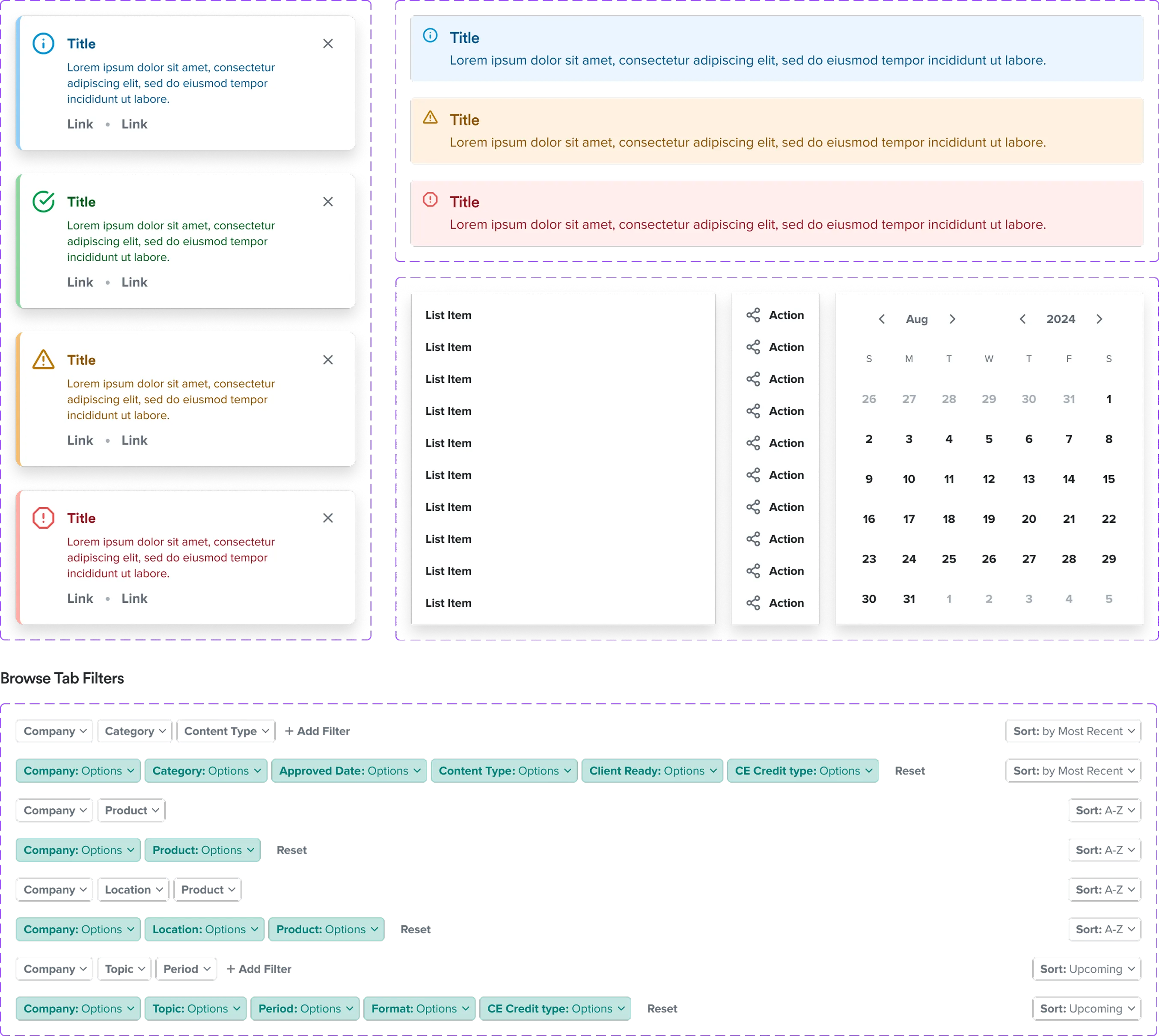
Combining atoms to create complex UI patterns, such as:
- Alerts & Banners
- Dropdown Menus
- Filters (with multiple states and variations)
- Pagination
Key outcomes:
- Components are flexible, adapting to different contexts and responsive layouts.
- Designers can rapidly prototype screens without recreating elements.
- Developers have clear documentation, reducing ambiguity and speeding up implementation.
“A solid system of atoms and molecules turns design into a living,
scalable toolkit for the entire product team.”
Outcome & Impact
Although the design system is still evolving, the work so far has
already delivered significant value:
For the Product & Users:
- Consistency: All UI components now follow standardized design principles, improving usability and clarity.
- Scalability: Teams can add new features without breaking the visual language.
- Efficiency: Designers and developers spend less time recreating elements and more time focusing on problem-solving.
For the Team:
- Streamlined Collaboration: Shared Figma libraries and clear documentation foster better communication between design and development.
- Reduced Errors: Tokenization ensures that updates propagate across the system automatically, reducing design drift.
- Future-Proofing: The system is structured to support upcoming features and new platforms with minimal effort.
“Investing in the foundations of a design system pays off in speed,
consistency, and long-term scalability.”